A Look Back at the Evolution of Web Design
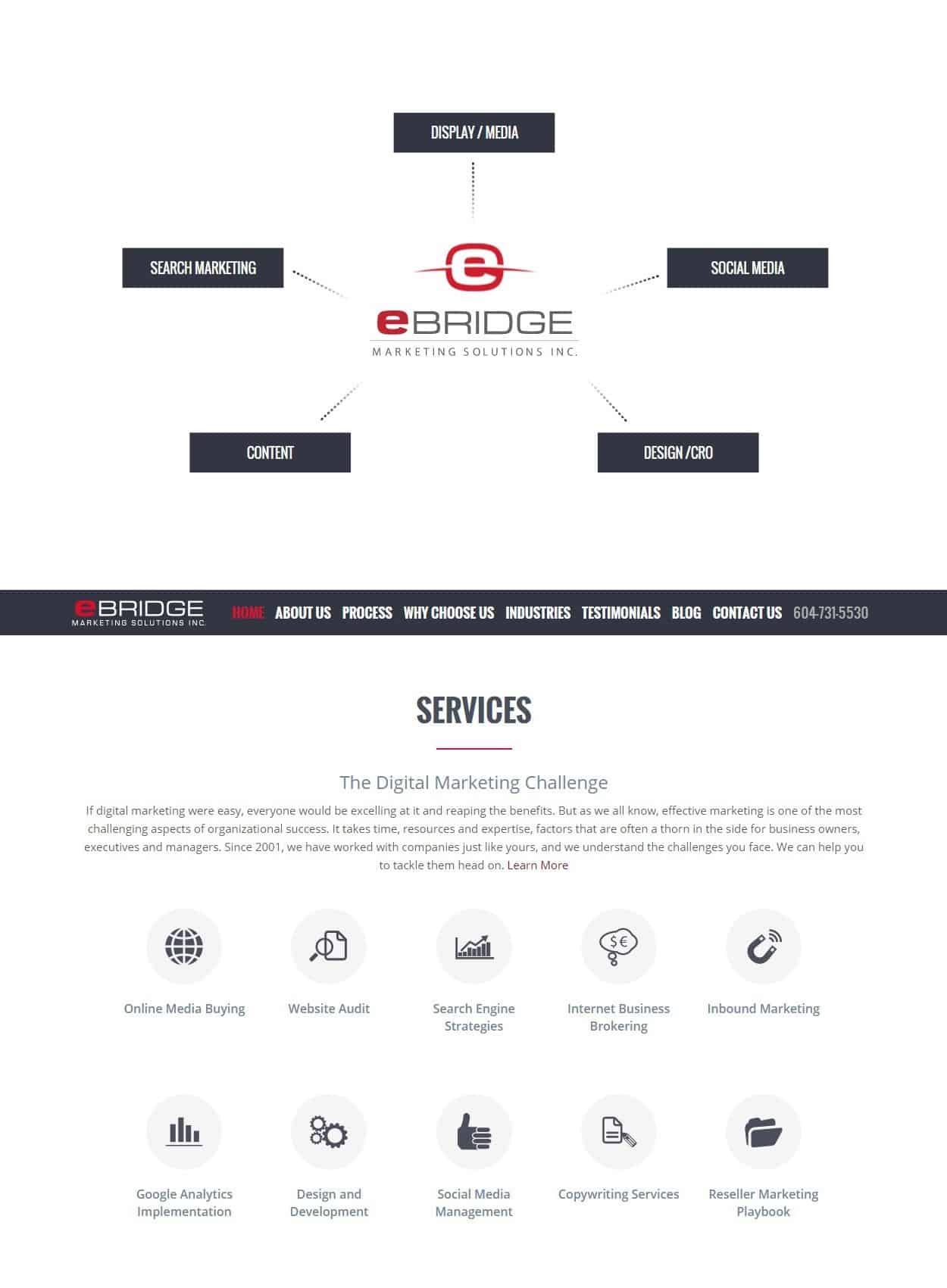
A little while back we launched the 5th iteration of the eBridge site. We thought it would be fun to take a walk down memory lane and revisit some of our previous designs, touch on what the trends were at the time and see where things are at now in the world of web design.
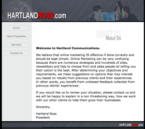
The first eBridge website
Here is where it all began back in 2001 with a small, simple, static website. We have evolved leaps and bounds since then!
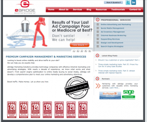
eBridge website design 2006 – 2010
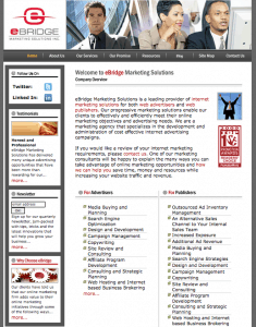
Fast-forward now to 2006 and our site featuring the table-based design that was popular at the time. While this is not that long ago relatively speaking, in web design it’s like eons and you can tell!
Social media was gaining mainstream traction and websites became focused on engaging users and creating community, hence our top placement of social media icons. We also added a newsletter sign-up to start gathering emails as part of our email marketing strategy. As you can see, it was a static design with no blog and no dynamic elements. How things have changed!
eBridge website design 2010 – 2012
Our next website reveals the changing landscape of internet marketing as we moved into what is referred to as Web 2.0 – where content and the rise of the social web were prominent influences on design. We launched a blog for one. We incorporated a scrolling header which was extremely popular at the time and still is, although less so. We also used call to action buttons that were absent from the previous design. Footer navigation was included to make our site content easier to find. The look and feel has also evolved, with more pronounced content areas and headings that make the information standout. We also took out those cheesy stock images and worked in graphics that had some more customization and aligned with our brand colours. In fact, the whole visual feel of the site is more strongly branded and looks more customized than our previous iteration.
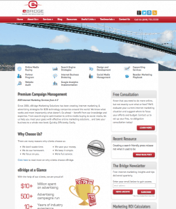
eBridge website design 2012 – 2015
With this site we can really see visually how web design is evolving. New elements here included:
- A large high quality header image that highlights our location in Vancouver, Canada and did away with the contentious scrolling header images.
- Customized icons for our marketing services to make them pop and scroll over functionality that brings up further content details on each specific service.
- Consistent call to action buttons that grab attention with our red brand colour.
- Side bar areas that look tidier and are easier to digest.
In short, the whole look is cleaner and more visually appealing.
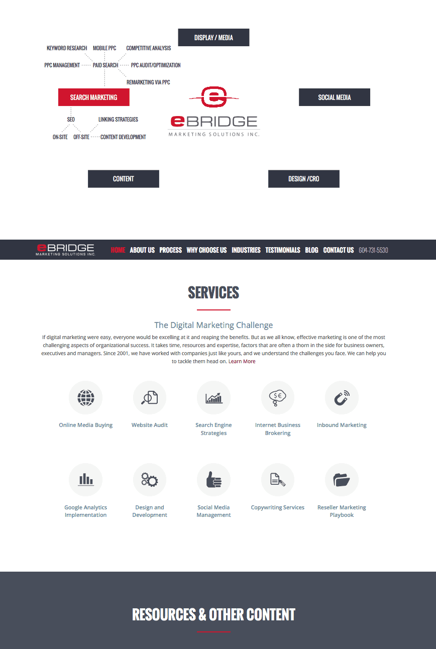
eBridge website design 2015 – present
Here is our current design launched last year. We shifted things to align with the latest in responsive design, also working in the infinite scrolling trend to be more mobile friendly. There is more flow to the homepage with all pertinent details available as you scroll down through the different sections. At a glance, you have a one page synopsis of the content available on the site. We worked in a functional header to include dynamic scroll over elements that highlight all of our digital marketing services. The new design also features more customized images and graphics, larger text and visuals and more white space.
Digital marketing trends and tactics are constantly changing and website design must align with that. Have an outdated site that you’ve been meaning to redo for years? Want to refresh your existing design to jive with current best practices? Contact us today to learn more about our website design services.
Posted February 19, 2016
Categories: eBridge Marketing Solutions' Blog,
Advertising and Marketing General,
General Business
Tags: Advertising, b2b marketing, B2B Online Marketing
